


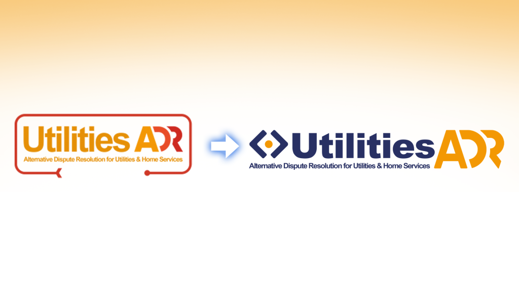
Here at UtilitiesADR, we’re excited to finally unveil our new logo and brand identity!
While our appearance has changed, our core commitment remains exactly the same: helping consumers and providers resolve disputes in a fair, efficient, and constructive way.
This rebrand marks an important step forward for us as we continue to improve our services, modernise our digital platforms, and create the best possible experience for everyone who uses them.
While you’re here, why not follow our revamped social media platforms too?
YouTube / Instagram / Facebook
Why Has UtilitiesADR Changed Its Branding?
UtilitiesADR is one of the 5 Alternative Dispute Resolution schemes operated by Consumer Dispute Resolution Ltd (CDRL). CDRL’s been in business since 2014 – that’s 12 years up to now!
In that time, we’ve seen consistent growth and development in all areas, but one thing has remained unchanged: our commitment to creating a positive, accessible experience for the consumers and organisations who rely on our Alternative Dispute Resolution services for their utility complaints.
You’ve been giving feedback – and we’ve been listening.
That’s why our new branding has been designed with clarity, consistency, and usability in mind.
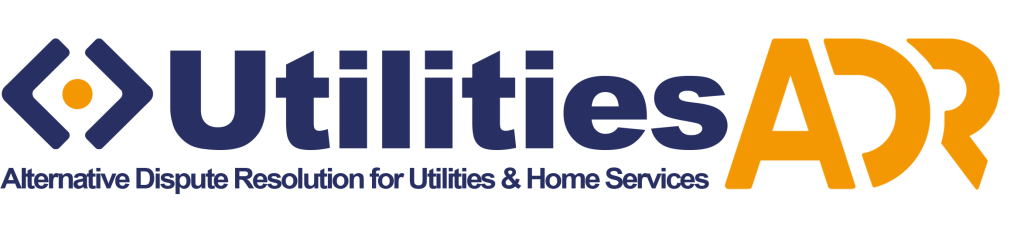
The updated design of UtilitiesADR’s new logo makes us instantly recognisable, while the modern styling better reflects the forward-thinking organisation we are today.
We’ve introduced a darker navy colour as a core part of our identity, creating stronger contrast against white backgrounds to improve accessibility across our digital services.
But, of course, this rebrand is bigger than just UtilitiesADR.
Across all of CDRL’s schemes, a refreshed ADR scheme colour palette has been introduced. This represents and celebrates the diversity of the services on offer across different industries. Each of CDRL’s ADR schemes has been assigned a signature colour, coming together as part of one unified brand:





Most importantly, this rebrand signifies a new beginning for UtilitiesADR.
We’re launching our redesigned website, introducing significant improvements to our online portal, revamping our social media presence, and streamlining our digital experience to make it easier than ever for users to access the support they need.
Everything has been designed with one goal in mind: delivering a simpler, clearer, and more user-friendly experience to make UtilitiesADR more approachable.
What Our New Logo Represents
The arrows within our new icon design represent the different directions that you, the consumer, and the provider involved in a dispute may wish to take a complaint. Disagreements naturally involve differing perspectives, priorities, and desired outcomes.
At the centre of the icon sits a single dot, representing UtilitiesADR’s role in bridging that gap. We provide a fair and impartial space where both sides can come together, navigate those differences, and work towards a resolution.
The result is a logo that reflects progress, connection, and collaboration: core principles that underpin everything we do.
Looking Ahead
Our new branding is more than just a new logo. It represents our ongoing commitment to innovation, accessibility, and delivering the best possible experience for our users.
As we continue to introduce new websites, enhanced tools, social media platforms, and improved services, our refreshed identity reflects the future direction of UtilitiesADR & CDRL while staying true to the values that have always guided us.
We look forward to this next chapter and thank everyone who continues to place their trust in UtilitiesADR.